Generative UI: the new front end of the internet?
This image posted on Twitter is a great summary of how AI is about to change our lives:
It’s a fun idea, that people might not have taken seriously.
And then, a few weeks later, Microsoft demoed this exact feature as a centrepiece in its multi-billion-dollar investment in disrupting how we all use the internet.
The new sidebar in the Edge browser can be used to compose a message (in this case, a LinkedIn post) and summarise a page (presumably made up of everyone else’s AI-generated messages).
I’ve had this sidebar stuck in my head for the last few days - alongside two thoughts.
Will that sidebar, over time, become the main screen?
What does this mean for the future of interaction and ‘product’?
Web design has been trending towards a singularity for the last 30 years.
In the beginning, the web was chaotic and idiosyncratic. It was, Space Jam, and Geocities.
Over time, the web got more professional, more organised, and more simple.
We’ve settled on design conventions, and everything has become very samey.
AI may be about to transform this from a design trend, to a platform shift. Because with AI, it is increasingly feasible to layer a completely separate user experience over almost everything.
This isn’t a new concept.
Google Duplex has been doing this for a few years. It can book cinema tickets on your behalf, by completing the task of navigating through the (often annoying) ticket purchase journey.
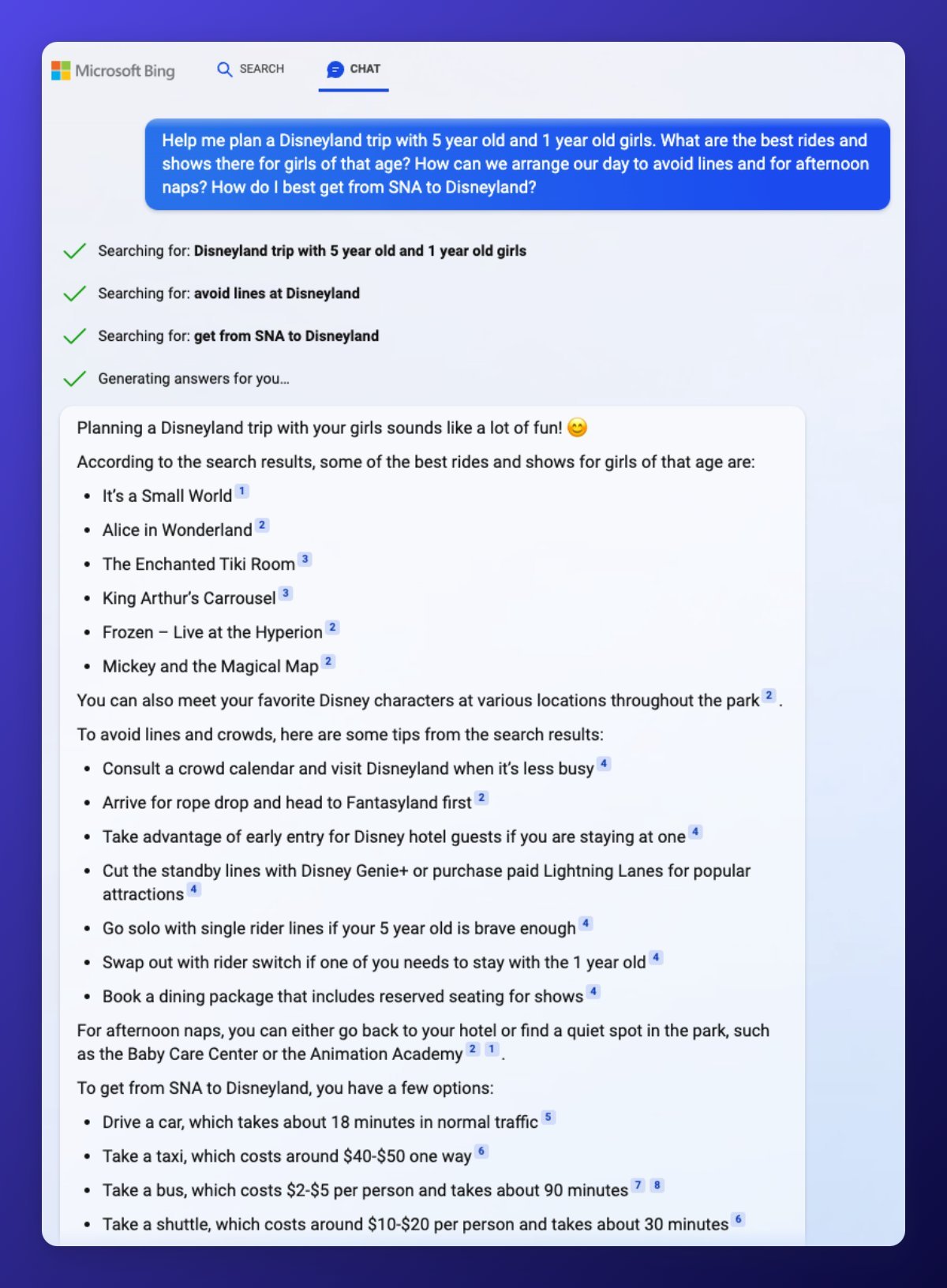
The new Bing Chat is on a similar path.
Put these ideas together, and you start to wonder whether the underlying websites are needed at all.
Bing + Chat searches the web and then constructs a response and references the sources.
In many ways, Bing would be better off having access to a structured set of raw/live data about Disneyland, and some functions (e.g. to book tickets) with which it could construct the response and take actions.
For Disney itself, this would be great. Alongside having an old fashioned website, it could publish content and functions specifically to be used by AI platforms to deliver personalised experiences that drive sales.
The same idea could apply to journalism, online shopping, social media, streaming video, or data visualisation.
Let’s take a Premier League football match. The current paradigm is well established:
Live TV broadcast of the match
Edited highlights posted on YouTube
Match stats tracked by Opta and available on many products (e.g. LiveScore, WhoScored)
Match reports and analysis published by journalists on traditional news and sports websites
This works pretty well, but it is a completely flat and generic production cycle.
In recent years, fans have sought a more personalised experience, especially through the growth YouTube ‘watch along’ channels, and post-match fan debates.
With AI, personalisation and presentation of the core experience could go much further.
AI systems could ‘watch’ the match, and construct personalised highlight edits on request for the user. I should be able to type in “Show me every touch that Haaland had”. “Show me the last 3 minutes”. I should be able to ask “How did Casemiro play?” and get a natural language response which pulls together his statistics from the match alongside general comments in his performance, a few video clips, and insights from my favourite journalists or bloggers.
As a user, there’s no great benefit to me in having these different products hosted in different apps. I’d much rather be able to do this from one clean, central interface…. which might look a lot like Bing Chat.
Front ends, on demand
AI is capable of this level of disruption in part because it is able to construct or generate many of the elements that made up the old ‘front end’ of the web.
The recent wave of GPT products are able to generate and manipulate content, generate and manipulate images, and write code.
If I go to GPT-3 and say:
“Write the html and css for a modern looking website that includes all the latest My News content, with thumbnail images.”
It outputs the code:
When I copy that code and run it as a webpage, I get this:
My News
Headline 1
Lorem ipsum dolor sit amet, consectetur adipiscing elit. Pellentesque eget aliquet nibh.
Headline 2
Lorem ipsum dolor sit amet, consectetur adipiscing elit. Pellentesque eget aliquet nibh.
Headline 3
Lorem ipsum dolor sit amet, consectetur adipiscing elit. Pellentesque eget aliquet nibh.
One of the fundamental challenges of product development is finding the right level of abstraction and generalisation.
Feature development and design are expensive, and features add complexity for the user. So it is beneficial to have as few as possible. The ideal product is ‘as simple as possible and no simpler’.
We have also got used to the idea that a product is defined by its presentation paradigm and its core set of features.
Twitter is a stack of text ‘cards’
YouTube is longform landscape videos
Instagram is square images
TikTok is short videos in portrait mode
Netflix is thumbnail carousels and full-screen viewing
These design paradigms are useful, and we do enjoy the differences. But they are also born of necessity.
I’ve lived this tension as a product manager. The core challenge of any team is creating a product that is simple enough to be useful … to a diverse range of users.
In an AI-native future, and an AI-native platform, all of this rigidity around the ‘product’ seems to fade away.
When browsing a data chart, the user could ask for an extra feature to be added (“Let me filter this by date”) and the system could both understand the request and immediately generate the feature and its front end.
Every user could get the ‘simple’ set of features they specifically need - and only those features.
A social media feed could be made up of every type of content and user experience.
We will scroll seamlessly through text, then a video, then a game, then a conversation.
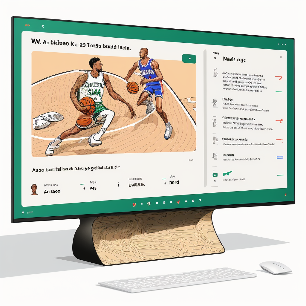
I might ask my chatbot to “Show me the latest Kenji López-Alt video, and the NBA scores, and WhatsApp chat with Family” and it will construct a page that puts all this side-by-side. (And useful ‘prompts’ like this may become actual products in themselves.)
Like Tom Cruise in Minority Report, we’ll have a very fluid, flexible and organic way to interact with technology… just without the magic gloves.
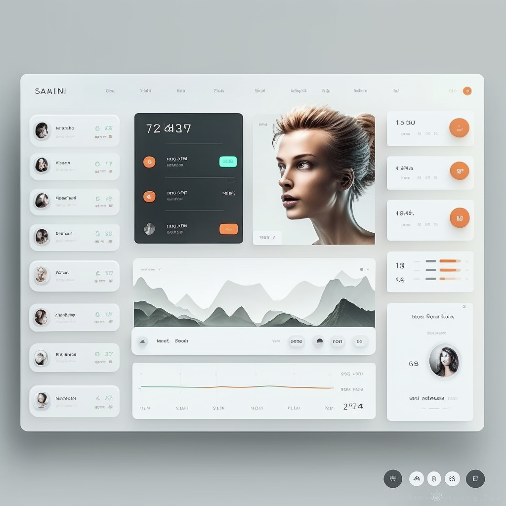
You can make a decent start at this already by describing the UI you want to see to an image generation model. I asked Midjourney for a design for a personalised homepage like the one I described above, and got these.
All of this points to a new stack for product development.
We’ve got used to separating the front end from the back end, but we’re looking at a future where the front end might not be needed at all, and the ‘back end’ might be built specifically to serve the functions of an AI platform.
The age of the headless product.


